Stock Trading App (native)
Synopsis
#UX, #IA, #Prototyping, #UI,
Designing the bank’s first Stock Trading app for mid/highly experienced traders & investors.
Team
Lead Designer UX/UI (myself)
Designer UI (junior-mid weight)
PO
Digital Analyst
Dev team: multi-pod
My role in this project
Design / CX strategy, Design approach & decisions, stakeholder mgmt, reviews & sign offs
+ Hands on Design
(UX – 60% / UI 40%)
The Problem
‘Without an app, we’re close to irrelevant’
There was a significant hole in the bank’s digital offering for traders and investors – a dedicated mobile app for easy and convenient trading / market research. The vast majority of competitors in the space offered this already and was seen as a key reason for low customer retention and acquisition in this area.
For mid-to high experienced traders and investors, you simply wouldn’t use this bank, whilst we don’t even offer a mobile app
The goal was not only to fill this huge product gap but make it a compelling product/featureset to draw customers in.
The Design
Stock Trading App
RESEARCH
Competitors
It’s fair to say a good part of user expectations in the space are already set and established by much of the competitors out there.
I spent some time reviewing a range of competitors covering both direct banking competitors and specialist stock brokerage services. There were no major surprises here – to launch any competitive stock trading app, we needed to cover:
- Explore markets, with realtime pricing
- Managing existing portfolio
- Charts (multiple options)
- Manage alerts on stocks/funds
- Shortlist / monitor stocks of interest
- Research and reading around topics, themes & individual stocks
Understanding our users
I was able to conduct a series of 20 min interviews with stock traders and investors to get a feel for how customers approach investing
User scenarios & thoughts
The research findings helped give an understanding of what traders / investors most often need to focus on, across different scenarios
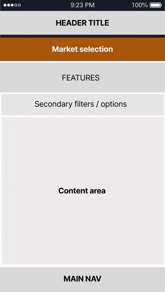
IA
Focus on structure
Broad categories emerged from those user thoughts and motivations, which helped prioritise distinct sections of content/features
Visualisation of most common linkages, leading to viewing a stock
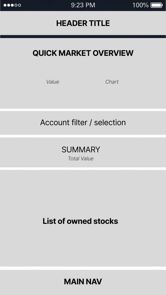
Sections & Structure
The research we did allowed us to get a solid structure in place that compliments our users expectations, habits and needs.
This also gave opportunity to exceed user expectations. Quick Buy was one idea that found it’s way to our top level app structure as a differentiating feature, compared to the competition at the time.
‘Quick Buy’ feature
The quick buy feature idea was born from those user thoughts and scenarios in which the customer already knows they want to make a purchase particular purchase. It was clear these kinds of purchases are often time-sensitive, reacting to market changes.
The idea of a ‘Quick Buy’ function is to simplify the buy process with the most straight forward (and quickest) order decisions defaulted (albeit changeable if a customer were to choose this).
Why no ‘Quick Sell’?
The equivalent for quick sell was discussed but it’s something customers naturally expect to be done from their existing portfolio (I go to the stock I hold, then sell from there). Buying however did have a common scenario
There was much consideration and discussion around the final top-level sections of the app before landing on our final decision.
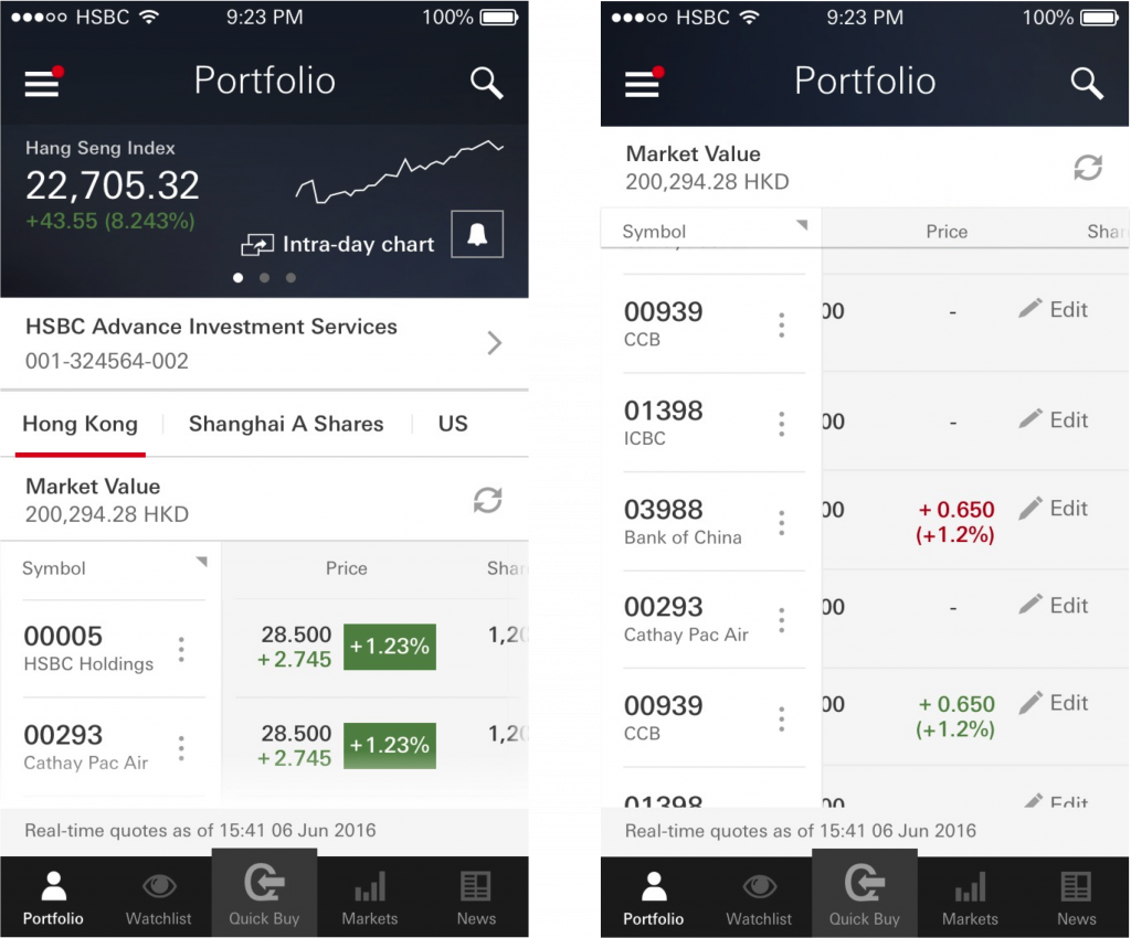
Watchlist
Some consideration was also given to whether the watchlist could or should live within portfolio (e.g. the thinking being…perhaps users might expect this given a watchlist contains stocks you may possibly add to your portfolio). I steered us away from this given the nature of a watchlist is something customers review and will reach for regularly – making this available at top-level nav means it’s always within easy reach and it also helps to keep mental model separation between what you own and what you don’t (yet) own.
News
For example, News could have possibly found its home within Markets. However separating out the ‘narrative’ from the ‘data centric’ markets felt it would speak to our customers differing mental models (differing ‘modes’ or approaches depending on scenarios).
Final Structure: Main Navigation

UI treatment of Quick Buy was a contentious one that I (still) don’t agree with but ultimately a decision by Product to ‘market’ this feature.
CHALLENGES
Problem #1
Data restriction curve ball
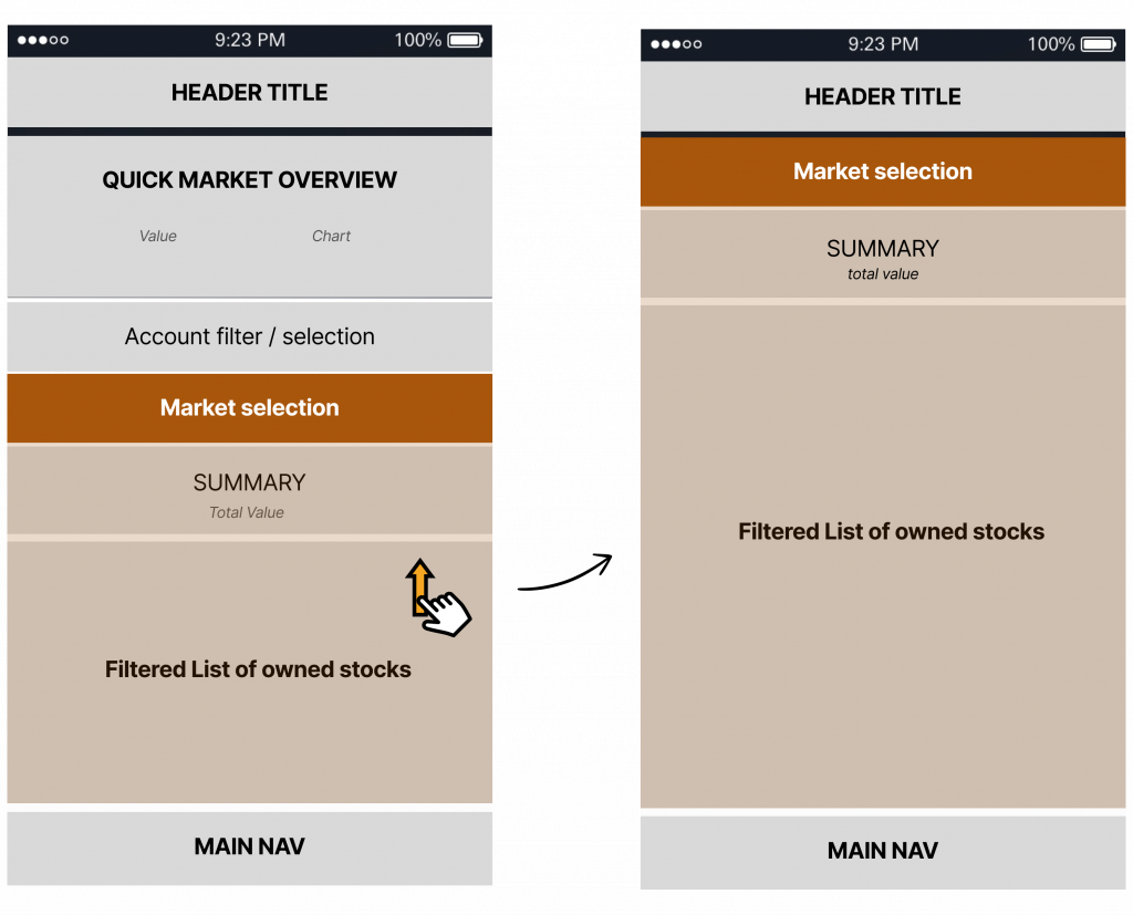
Impacts to IA
We decided the market selection must be baked in to the IA (for now): the reason being, those sub-market selections are crucial for users to be aware of, given our high confidence around their expectations: users assume they’re viewing all holdings unless, unless they chose otherwise.
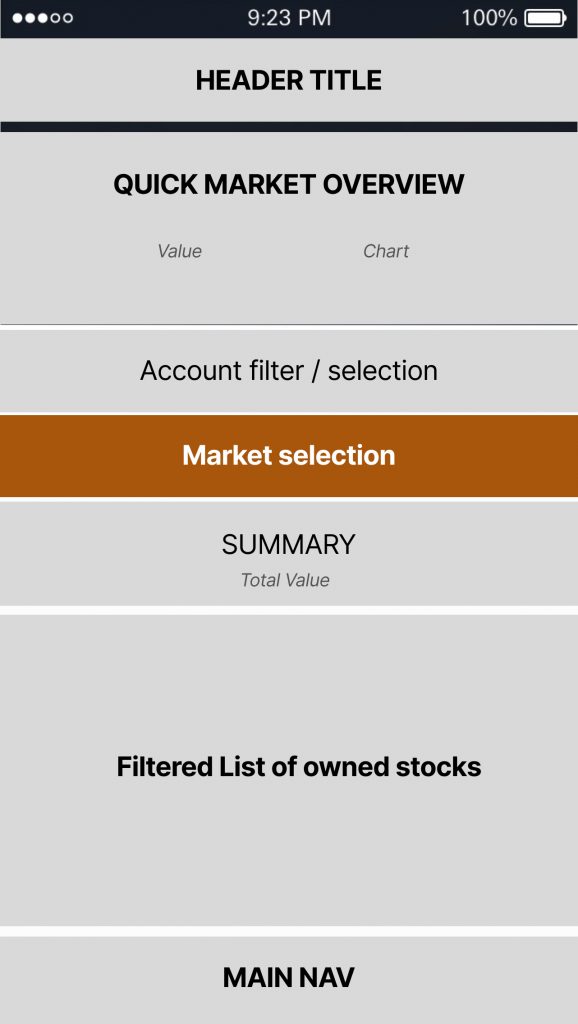
The lesser of 2 evils:
Better to be…
clear/transparent about the data situation and risk small inconvenience of the extra persistent content (showing market)
-vs-
…the alternative risk of users not realising what market they’re viewing and inevitable frustration and worry:
– not being able to locate ‘xyz’ stock
– or worrying you’ve lost part of your portfolio.
The solution was designed to work well for the other crucial part of the app: Markets – a consistent approach to help users acclimatise and become familiar with this ‘quirk’ compared to other stock apps.
Problem #2
In depth information on mobile
Salient information, whilst conserving space
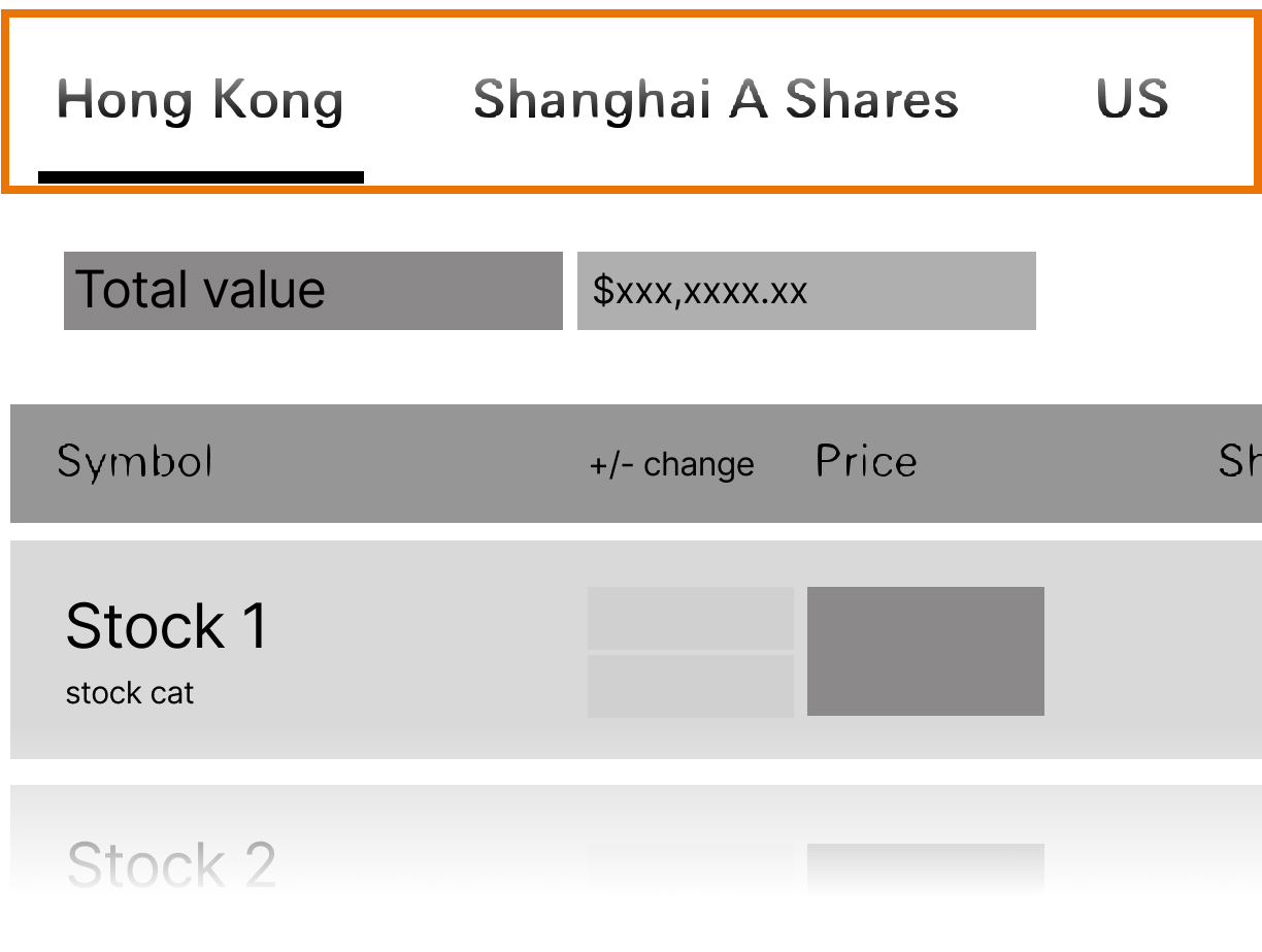
Horizontal scroll for tables
Part of the solution was to utilise horizontal scroll to give easy access to more data points depending what the user prefers to view for that particular stock(s).
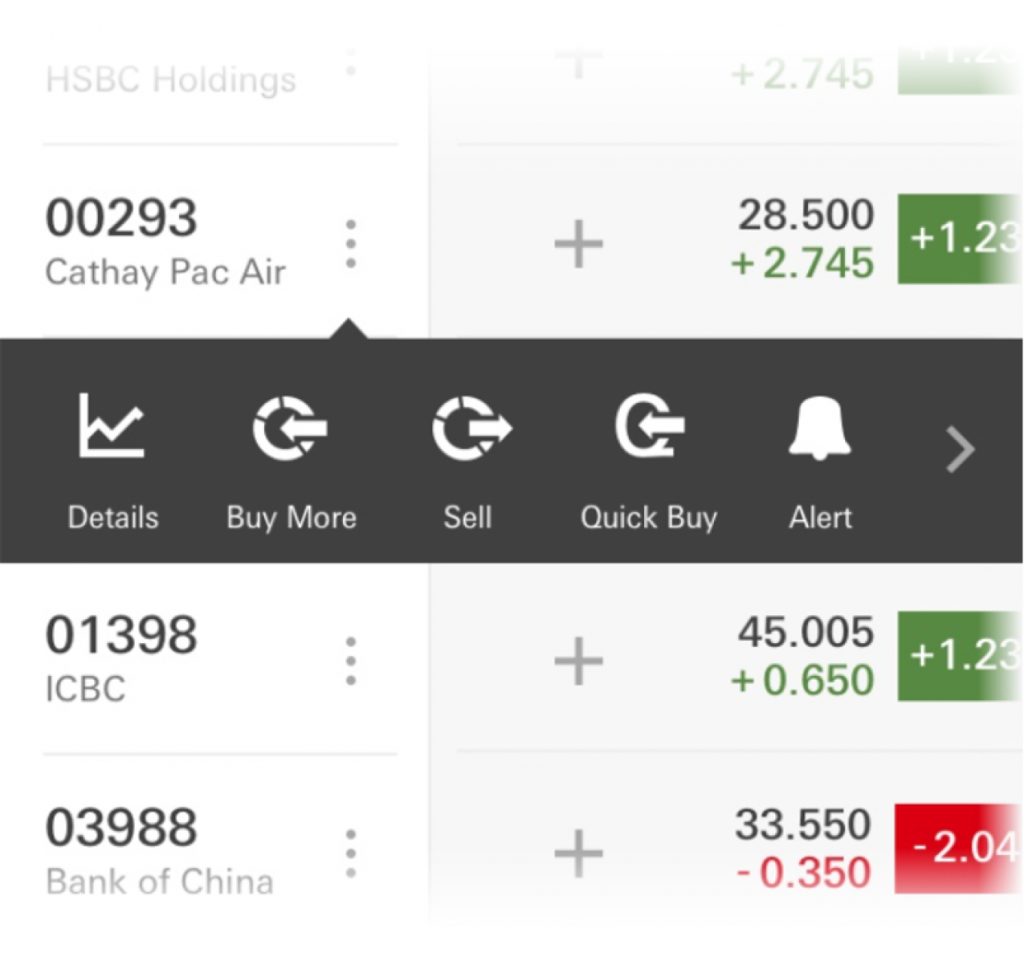
Stock contextual menu
There are always several possible actions users may want/need.
The design allows quick access to any of them through an expandable contextual menu.
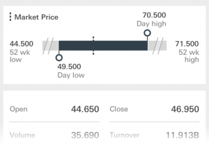
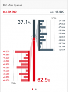
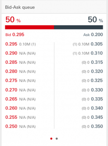
Supporting visuals
These visualisations were intended to help users understand the data and proved particularly useful for mid-level experienced users.
Surprisingly, during testing we found even the more experienced traders who are very used to scouring tables of data, found these visual summaries much quicker to digest.
Detailed data in a table view is always available as well for those who need or prefer this.
FLOWS
User Flow example – Alerts
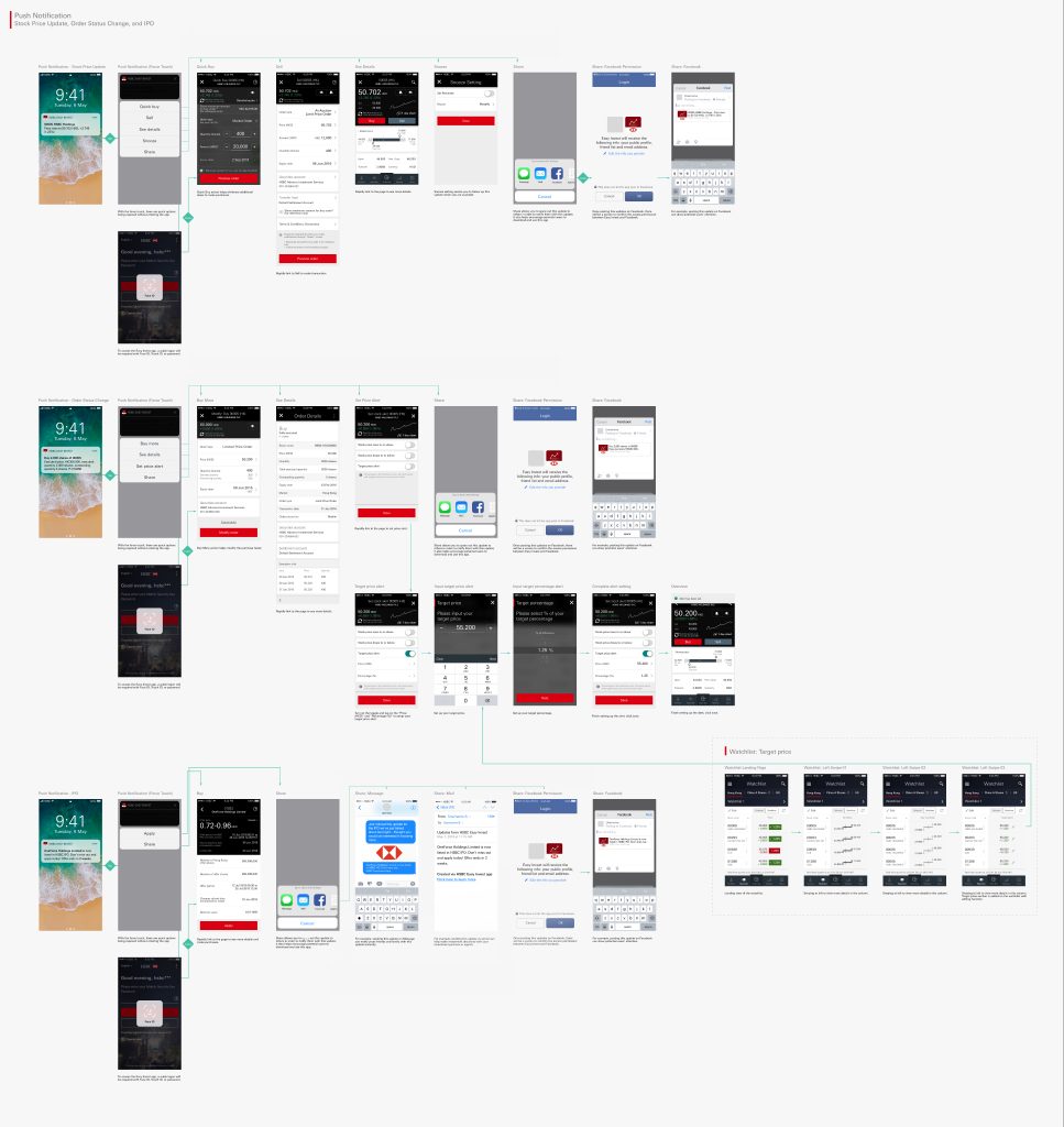
PROTOTYPING
Prototyping was done throughout the project when needed, often for user research / testing purposes but also serving as a useful way to demo to stakeholders and devs.
The following are prototypes made in Flinto, fairly late on in the design process as we were testing user interactions and making sure they could explore/locate and understand information they would need.
Scroll transitions
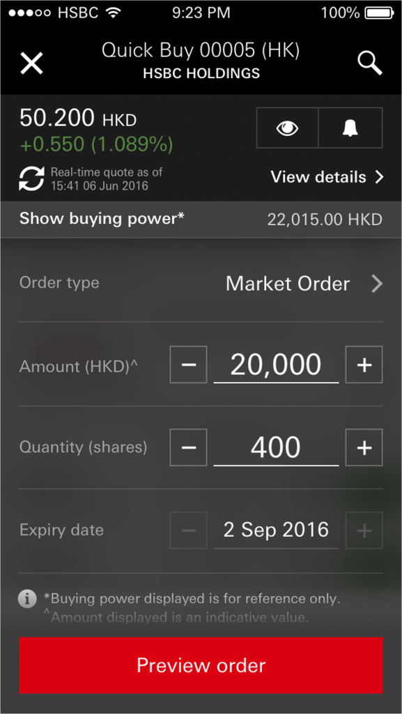
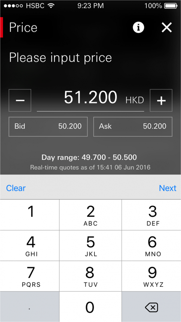
Quick Buy
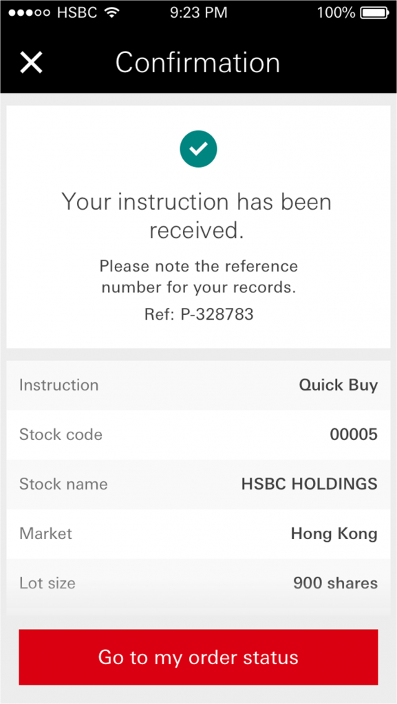
User actions: Portfolio > taps Quick Buy > chooses recently viewed stock > changes quantity of buy > reviews preview > confirmed
UI
Quick Buy
Further differentiated from ‘Detailed buy’ with dark background colour
Simplified order form for a quick stock purchase – allowing rapid reactions to the market
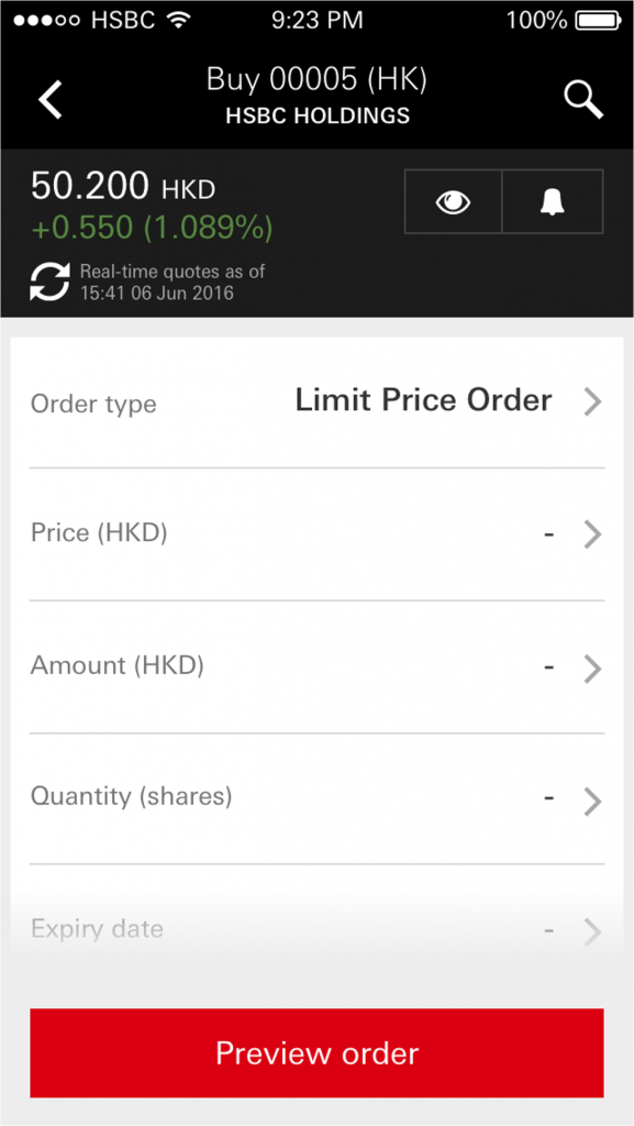
Detailed order
Detailed order allows many more order types and options for settlement accounts and execution.
News (narratives)
Relevant news to portfolio holdings, or more general news headlines.

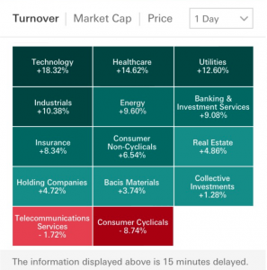
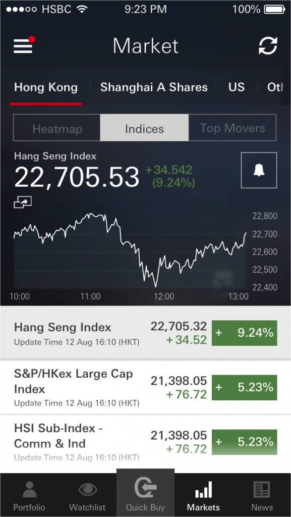
Market (data)
Overview of market movements

The Impact
MVP
Our MVP for launch was not without some unavoidable restraints on the experience, as mentioned. Despite this, the uptake and response via App Store feedback and targeted surveys in the following weeks & months were actually positive on balance.
Despite some frustration, the arrival of an app for trading was welcome for many existing customers – with this being such a long time coming.
Realtime vs Delayed
The biggest issue for customers was more regarding the realtime vs delayed data calls/price quotes. This was thanks to an old system architecture forcing us to use expensive back-end / API calls – whilst minimised, the impact in the short to medium term was frustrating in particular to traders relying on frequently refreshed data.