
Complex design in Asia: Structured Products
Synopsis
#UX, #Research, #UI, #prototyping
This project was a first for the bank: introducing a complicated, high-risk investment product into their online channel and expanding the reach and revenue stream in Asia. Structured Products had previously only been available to customers through face to face or phone channels, given their inherent complexity and higher risk levels.
Team
1x PO
1x Lead Designer UX/UI (myself)
1x UX/UI hybrid (mid-weight)
1x Analyst
1x Dev pod
My role in this project
Design approach & decisions, research, stakeholder mgmt, reviews & sign offs
+ Hands on Design
(UX – 65% / UI 35%)
The Problem
Can we sell products this complex online, without a person?
These products were previously available to customers only via face to face / phone channels, due to their complexity and high-risk nature. The products have thick, detailed term sheets each with various nuances, scenarios and outcomes depending on how the market plays out. Advisors handle this in person by taking the time to explain each scenario and make sure the user understands. Capturing and condensing this level of information (as much as feasible) into an understandable and usable product online, was a tough design challenge.
We’ve never tried to sell these products online before – they’re so in-depth and complicated. However if we could that’s a new revenue stream for us
The Design
Structured Products
UX
Finding relevant products
User mental models
I managed some research sessions out in Hong Kong to understand the mental models for investors of mid-to high experience level.
For investors at this level, these products are not typically considered without having some boundaries in mind. Why is this?
Investors tend to already have a view on the market(s) they’re focussed on
…and if they don’t, they’re unlikely to be investing in high risk products.
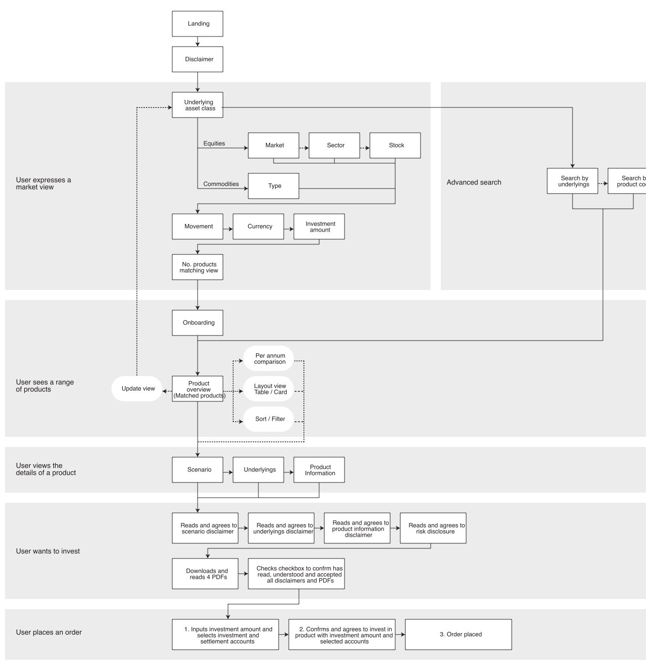
Structuring the flow & IA
As such, we decided to structure the journey around this: Users would first express their market view before anything else.
But hold on…which market? In which country? Which index/indices are you focusing on? On what time horizon are you investing? What about currency? and so on….you can see how this would become a taxing set of user selections/filters to sift through if a typical UX/interaction approach had been taken.
User Flow
Challenges Overcome:
Communicating complex product features
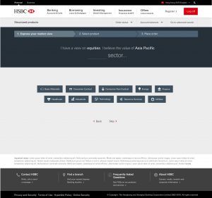
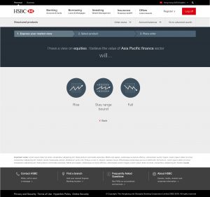
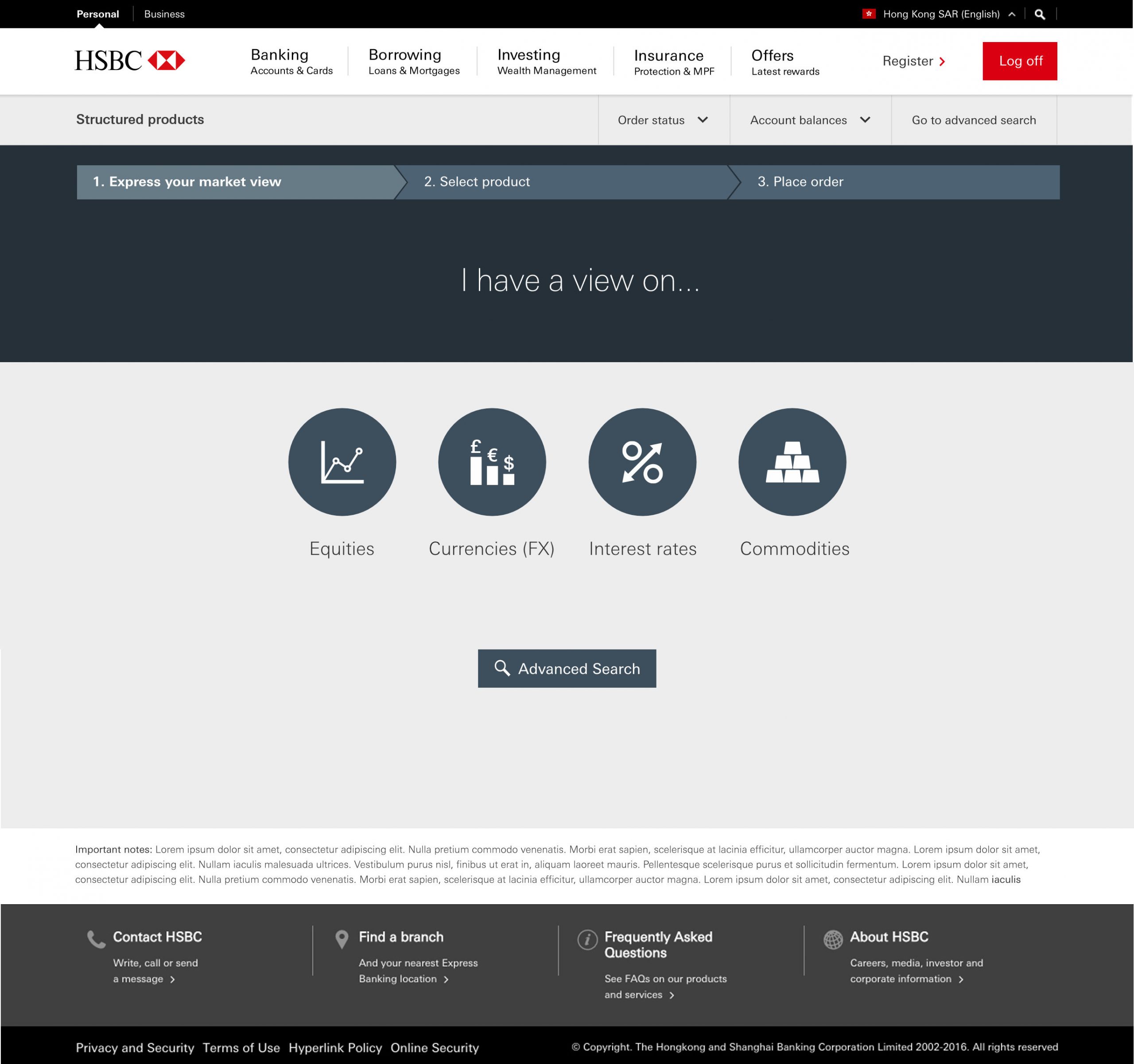
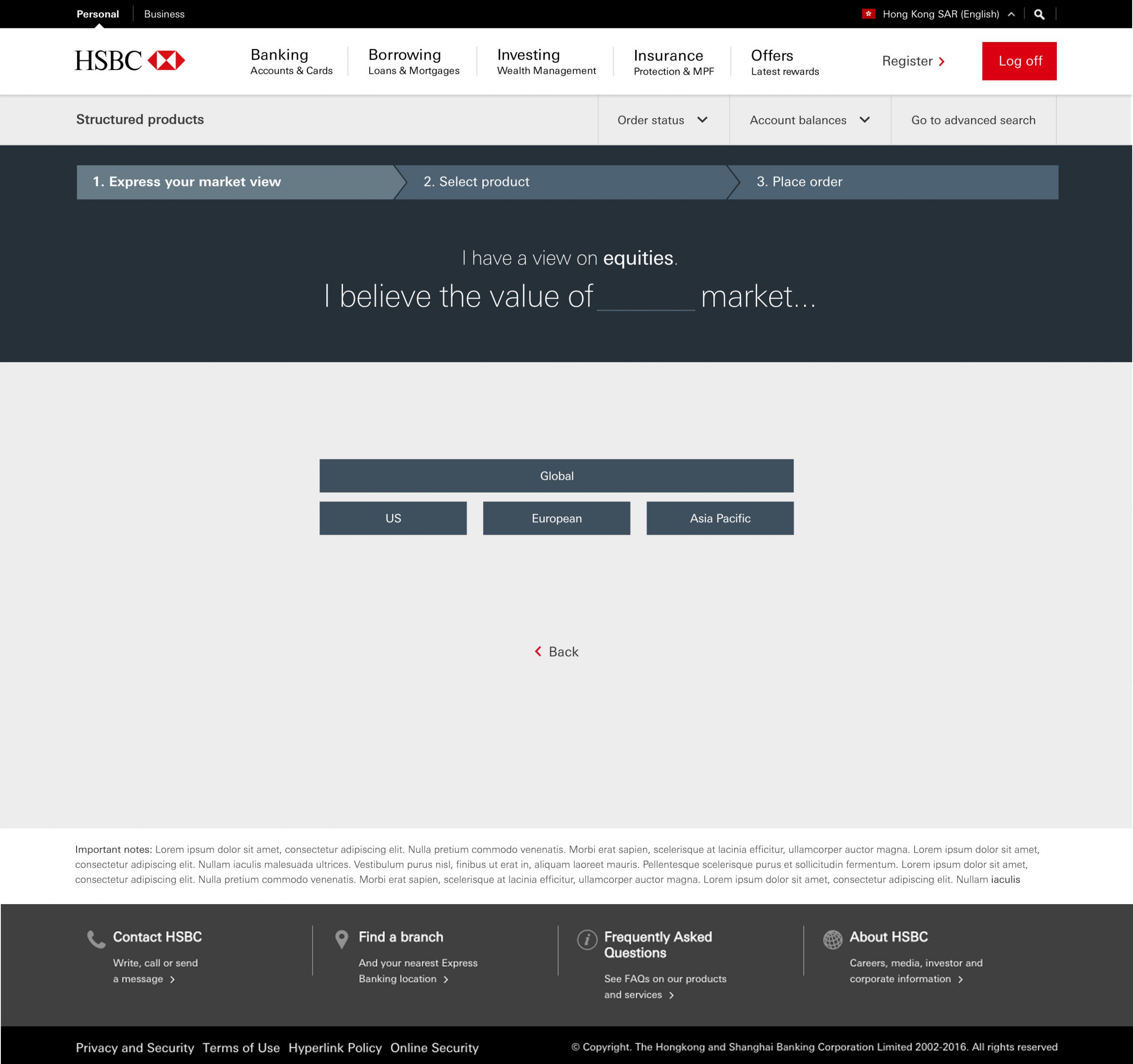
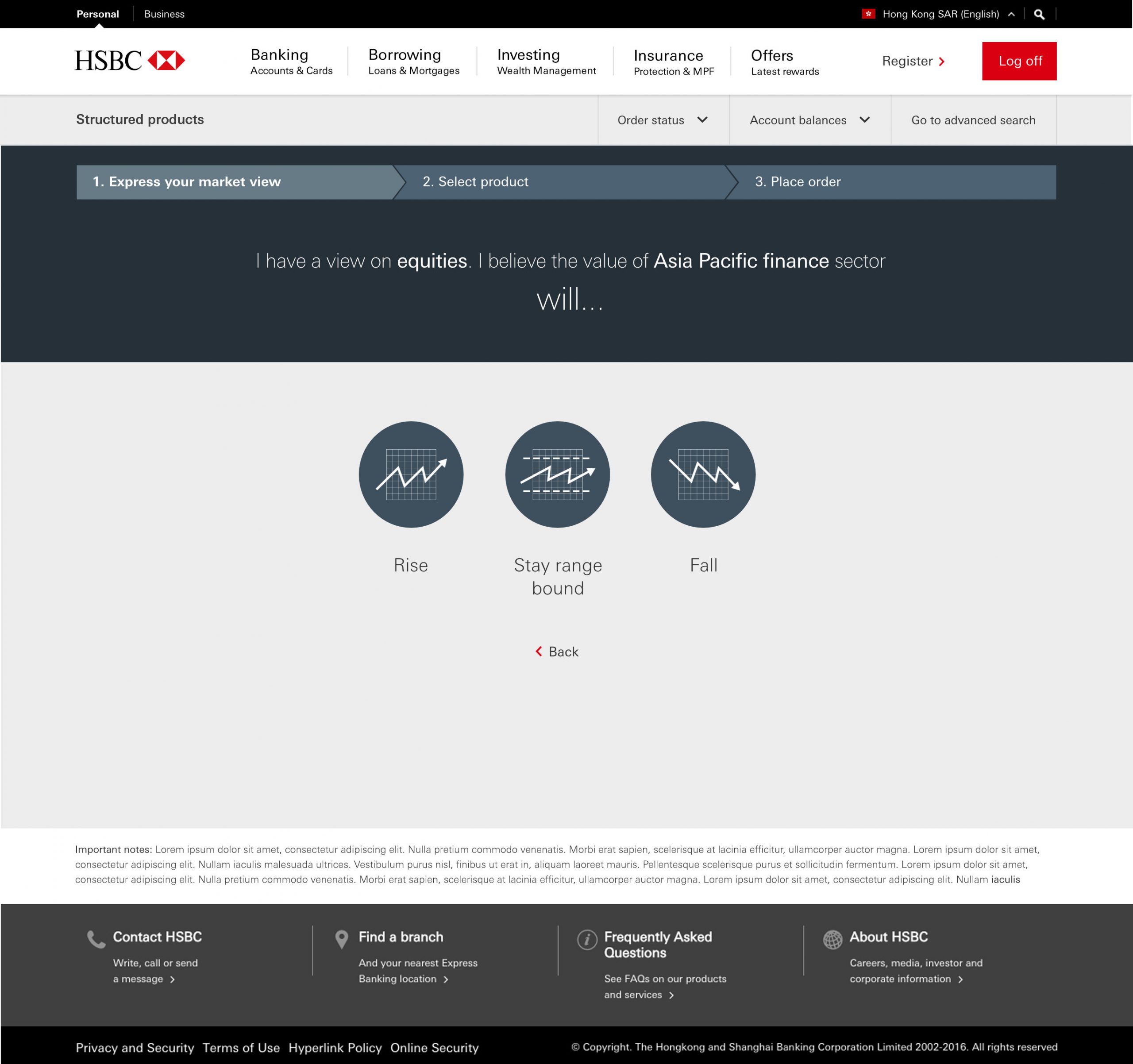
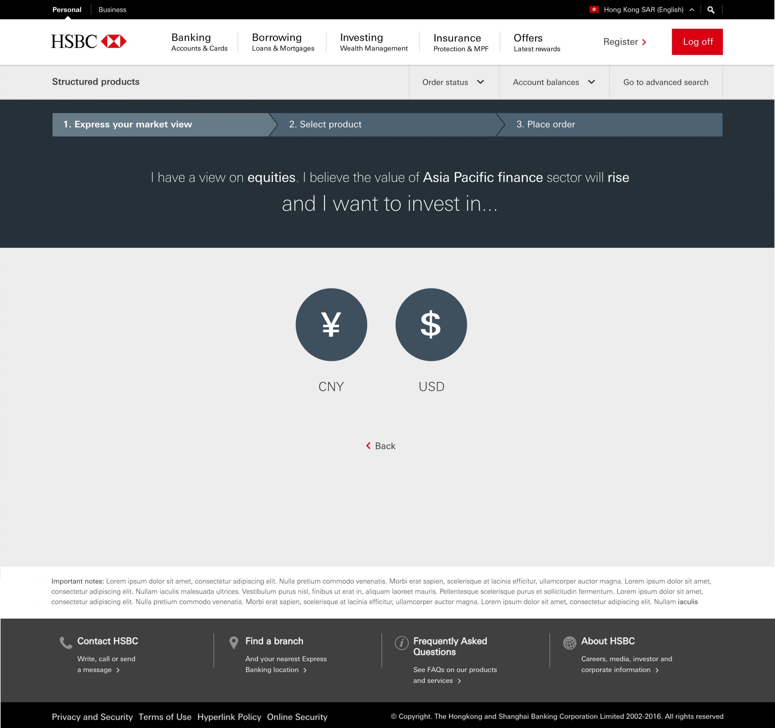
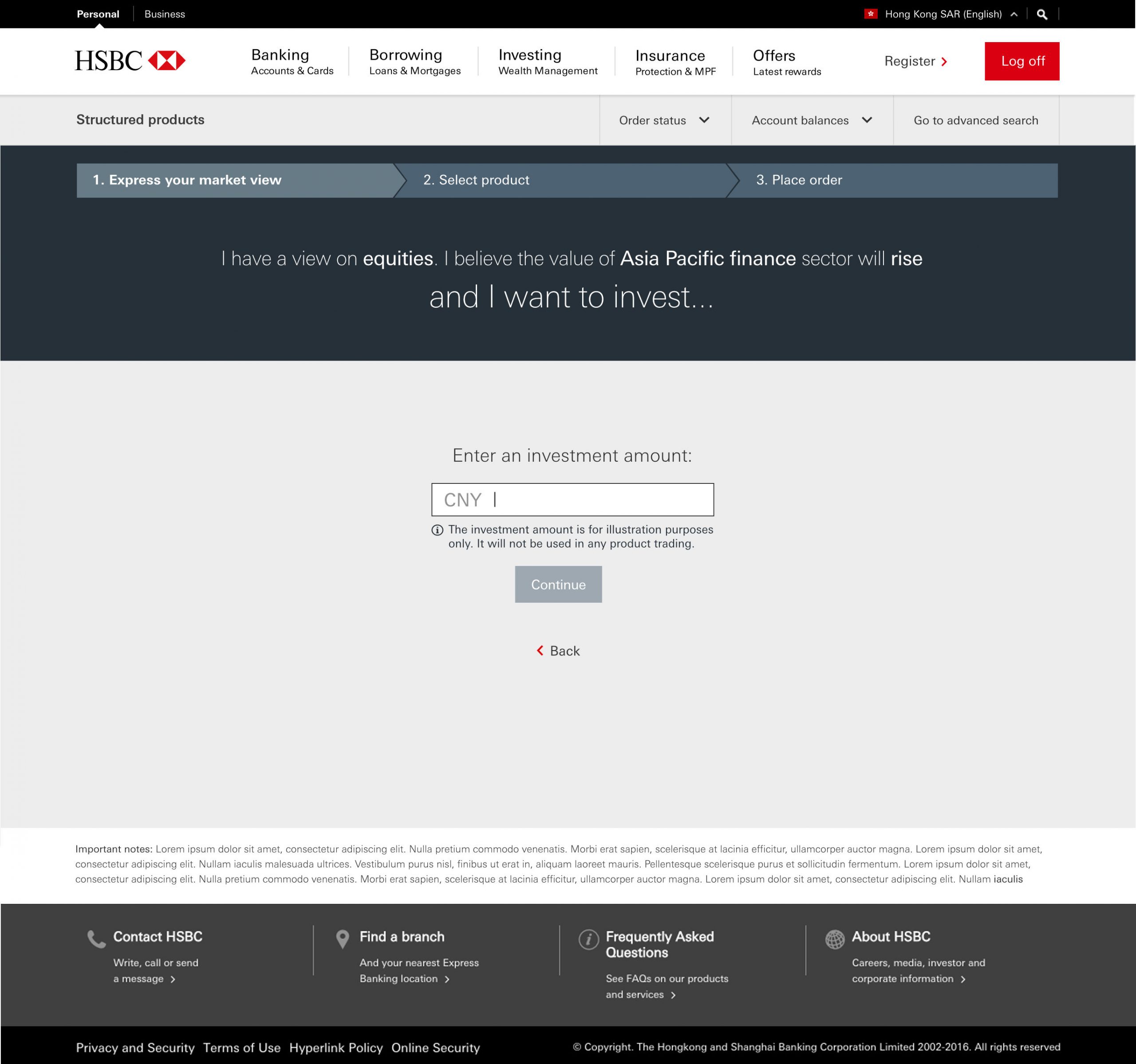
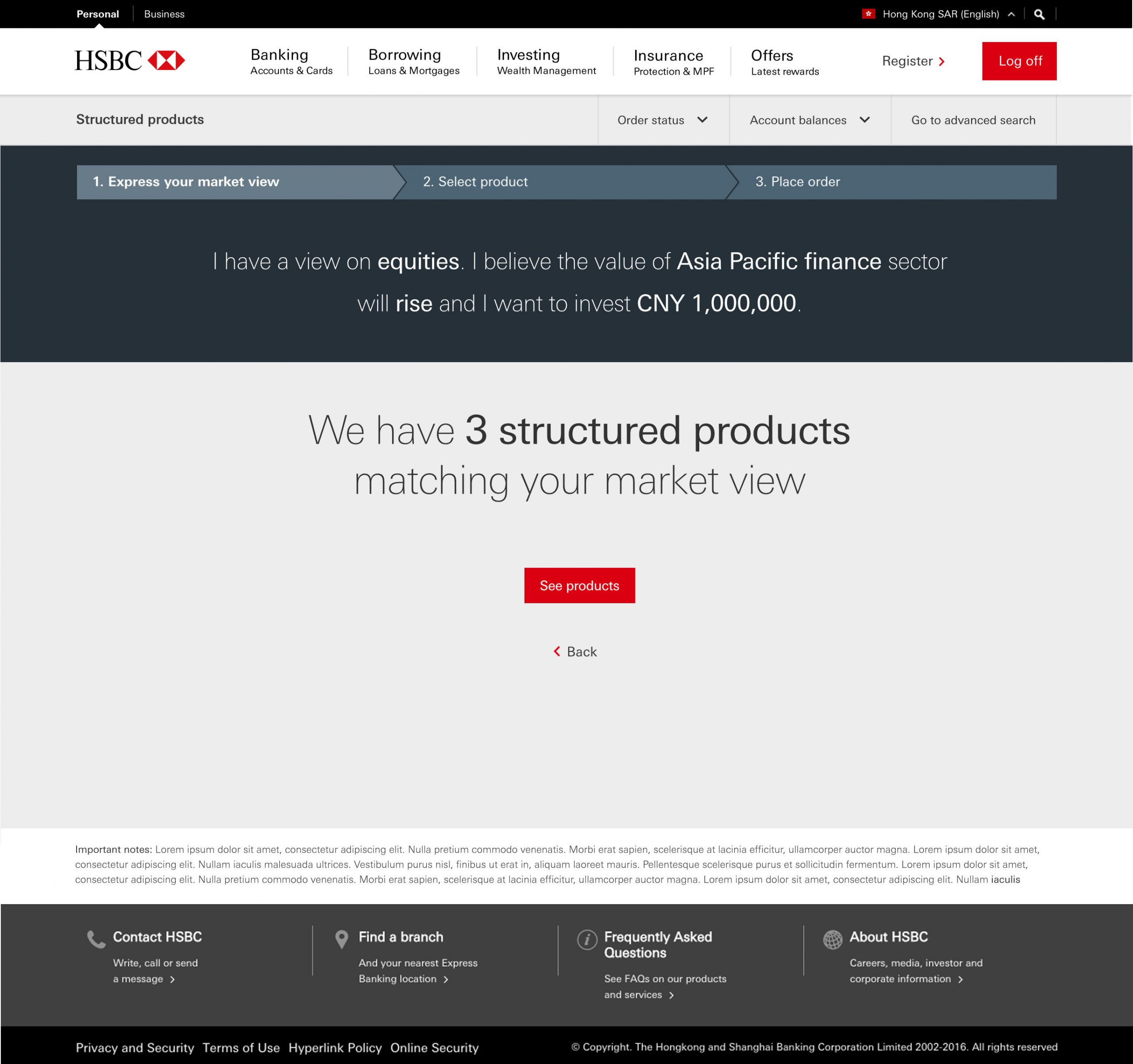
1. The ‘Sentence Builder’
I needed to find ways to make this experience feel simple and brisk (compared to the alternatives) whilst still capturing the customer investment view from a myriad of possibilities. One of the ideas from ideation was a sentence builder. I sketched up and tested this approach with encouraging results, enough to continue exploring the idea.
Example sentence builder flow:


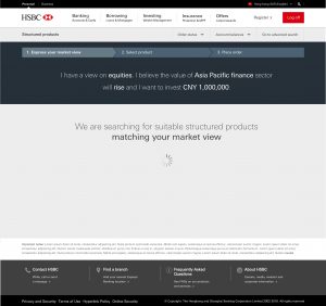
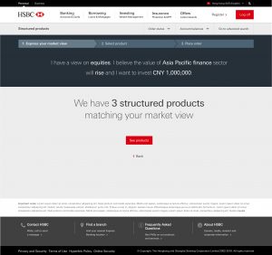

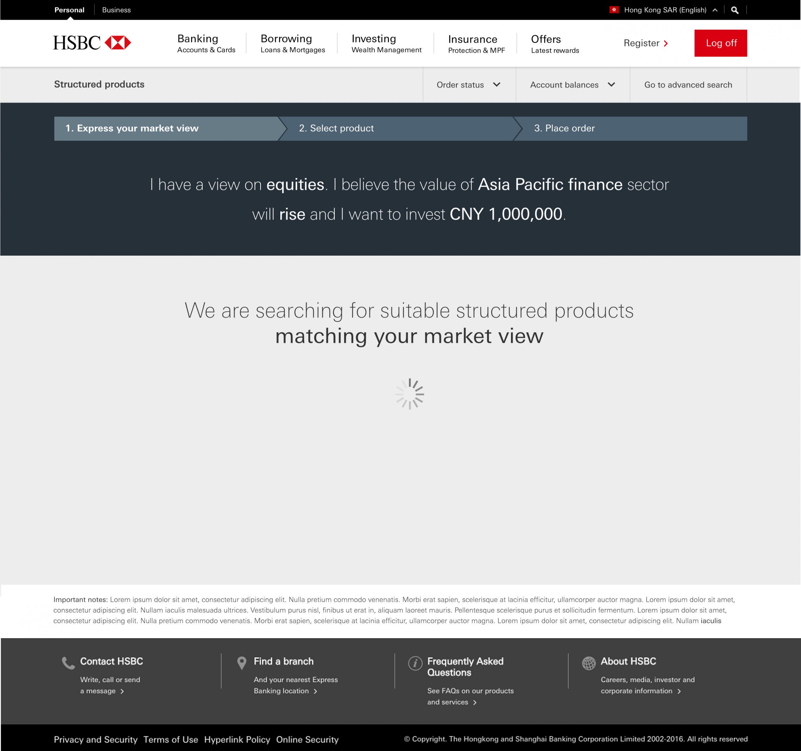
Example showing product results
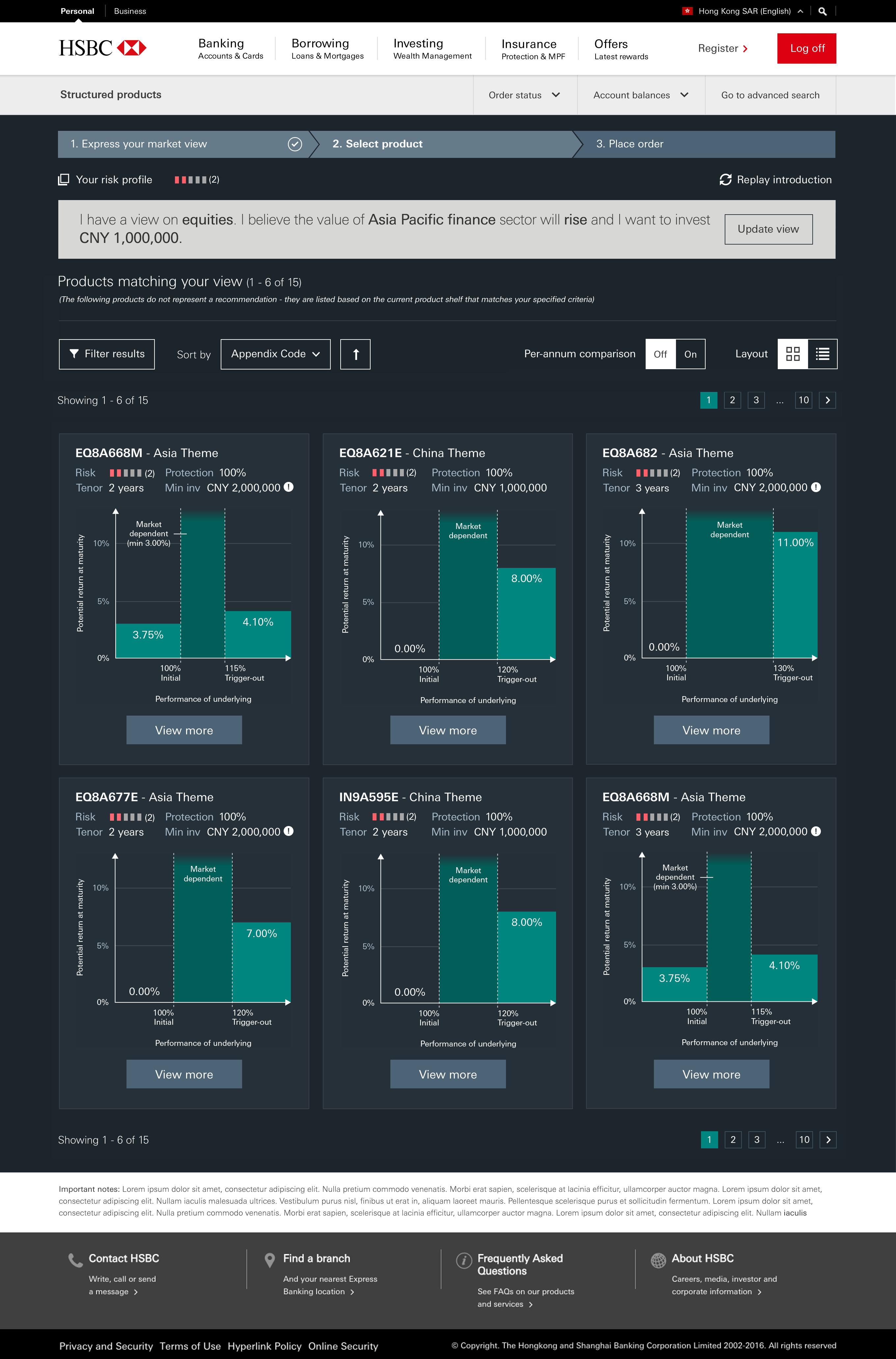
2. Communicating complex product features
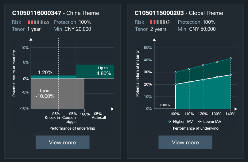
Product card overview
After user research/testing and multiple iterations, we managed to communicate the details needed at a summary level in a card format. This was tough given the large feature variation across each product. Thanks to this user validation, I felt very confident we show enough summary detail needed to help an upper-mid / highly experienced investor in Asia decide if they’re interested to know more.
Our new visual interpretations (not part of the product term sheets) were a crucial ingredient in helping users quickly assess and compare (within reason) these products.
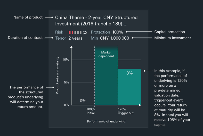
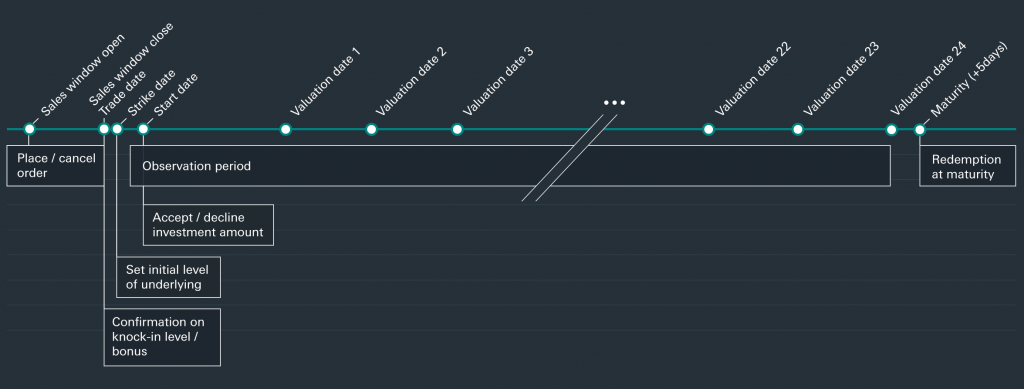
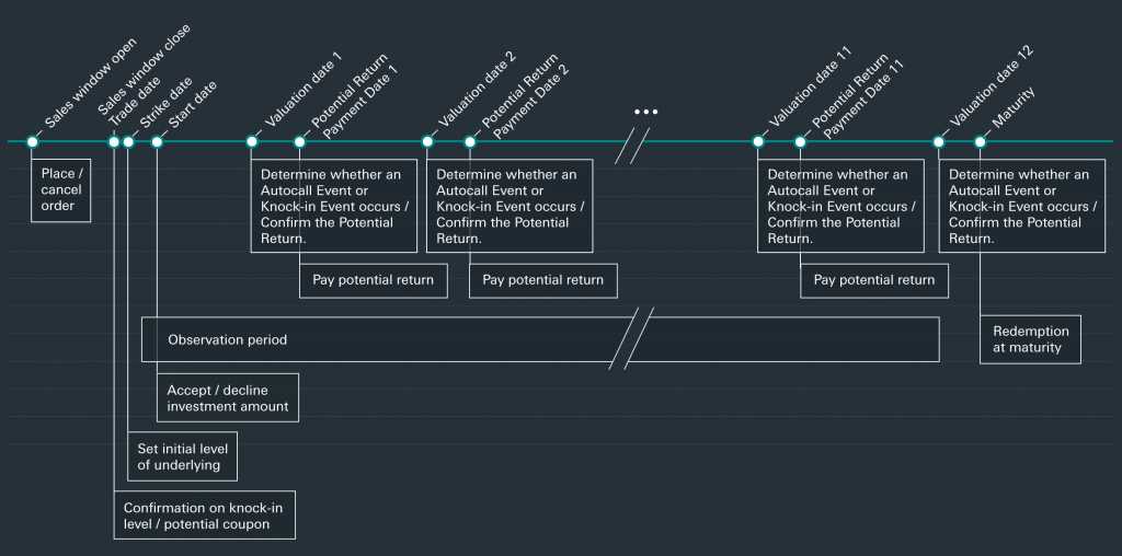
Timeline stages view
Similarly, an idea to visually map the timeline of the product with each key stage, proved incredibly useful for users in our research.
Invision prototype
View small Invision prototype (opens in new window)
The Impact
1. Business: new revenue stream
The business benefit was significant, with revenue increases from a brand new online. This wasn’t just the ‘shifting’ of offline sales onto online (a cost saving for the business) – but this online experience tapped into to a healthy demand for this kind of convenience.
In context of the whole customer base, the reach / usage was niche (as anticipated) but those who did were actively using this amounting to sizeable investments
This encouraged a separate initiative to revamp and expand the products on offer via this feature (and the face to face channels).
2. Customer: strong metrics
The metrics we track (standard funnel tracking + dwell time) were solid & healthy from launch for this one (compared to other ‘complex’ journeys), testament to the user research and validation.
For future improvements, we did capture some useful feedback via feedback forms and short surveys for amends and improvements
- Edge case: there are some occasions, albeit rare, where some customers want to browse products and drill down
This definitely wasn’t something to fundamentally change our approach or design, but was an edge case we could cater for easily with an option to bypass the sentence builder if needs be – added to backlog