FX App (native)
Synopsis
#UX, #Flows, #Research, #Interaction, #UI
A new market was identified within the existing customer base for an ‘on the move’ mobile feature set, focussing on customers with frequent FX (foreign exchange) payments & transfers needs. The product/sponsors decision was to create a new standalone native app.
Eventually this would be deprecated with the most useful features being integrated to the main app. Until then, this app was to handle all frequent FX users / traders needs and reduce customers using competitors.
Team
1x PO
1x Lead Designer UX/UI (myself)
1x UX/UI hybrid (mid-weight)
1x Analyst
1x Dev pod
My role in this project
Design approach & decisions, research, stakeholder mgmt, reviews & sign offs
+ Hands on Design
(UX – 65% / UI 35%)
The Problem
There were customers of ours actively using services elsewhere for their FX transfers payments and trades – simply because there are better designed services out there.
The benefit of using HSBC for FX is the – but we were not making this easy and convenient for FX focussed customers.
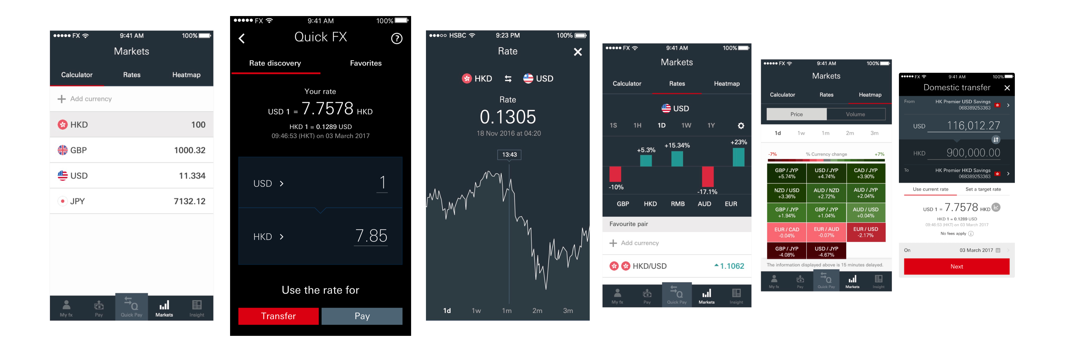
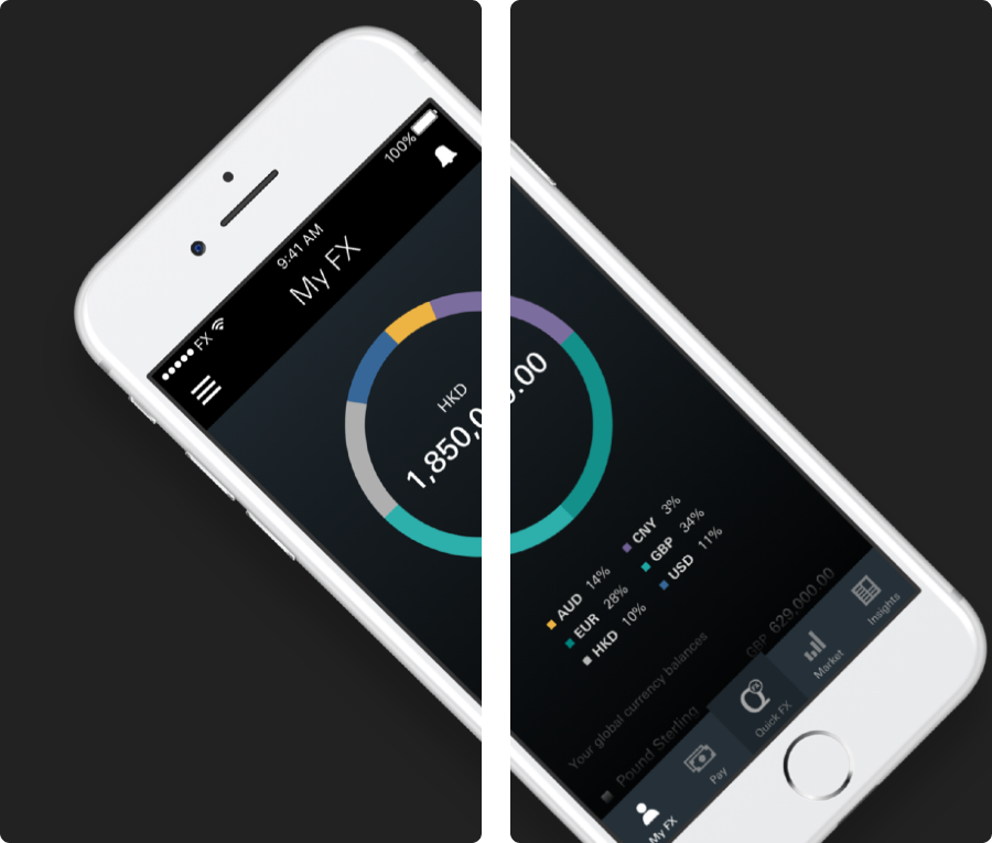
The Design
FX app
User Research
Our Target Users
Through a combination of data analysis and small targeted surveys – we found frequent and/or large FX transfer behaviours, tend to be driven from a small set of needs:
Competitor Research
I reviewed competitors providing FX, market rate and transaction services
- Found many competitors appeared to do one thing well but not many were a one-stop-shop allowing transactions and payments as well as tracking, alerts
- This was also useful inspiration for the design phase
Qualitative: Focus group
We drilled into this to find more about the typical behaviours of each type of customer
Key findings
It’s really all about the rate
A ‘decent rate’ may matter to everyday customers sometimes but it’s nothing compared to these customers. The frequency and/or size of transactions are often substantial, so even a small 0.01 difference in a rate is a big deal.
Market context is crucial
To judge whether the current rate is worthwhile – the first thing customers reach for is context of how that currency pair has been over the last <x> days/weeks/months, depending on preference.
Timeliness
Currency markets are ‘live’ 24hrs/7 days a week – the smallest of changes can have an impact on these customers so we must make sure our app experience allows them to be reactive and also pro active
Flexibility
The approach and preferences of how customers assess the currency market…
eg using percentage changes vs exact number increases/decreases, 5 day vs 1 month time horizons…chart types
Ideation & Prioritisation
Top level features:
- Overview of money / currency
- Markets
- Alerts
- Currency transfers
Still under construction
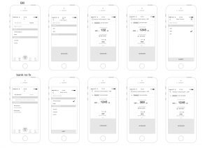
Screens & Flow (extracts)
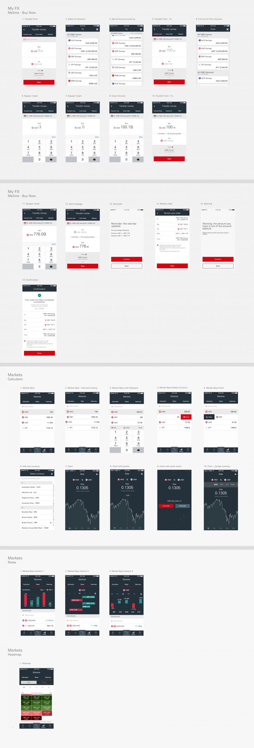
Early wireframing excerpts
User Testing, Reviews & Design Iterations
The Impact
Data affirmed
Whilst it was a deliberately slow rollout with gradual targeted marketing to this niche customer subset – over time, the customer and transaction data (and in turn, revenue) affirmed this product was proving useful to our customers (active usage) and our key stakeholders believe it has reclaimed transactions/income directly from competitors.
Customers no longer needed to jump ship to research and trade/transact – the functionality now available in one place, along with the bank’s very competitive rates
Whilst there were some performance issues with the first build, there were no usability issues and feedback/sentiment via App Store was positive overall – supported further via targeted surveying via face to face channels.