Stock Brokerage Platform
Synopsis
#UX #ExpertUsers, #IA, #UI…
Redesigning the bank’s much neglected and unloved stock trading platform, into something customers would want to use. This was a responsive browser design with heavy prioritisation of desktop / tablet viewports, based on research and product strategy (decision from Head of Product).
Team
Senior Designer UX/UI (myself)
+ part-time Designer UI (mid weight)
PO
Digital Analyst
Dev team: multi-pod
My role in this project
Design approach & decisions, stakeholder mgmt, reviews & sign offs
+ Hands on Design
(UX – 55% / UI 45%)
The Problem
Customers had been using an archaic platform desperately in need of a rethink/redesign.
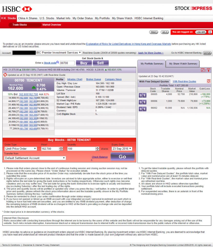
Outdated & poorly designed
Example screen showing the old platform
Biggest challenges
- Dense information: the level of detail users need at their disposal is significant
- Platform limitations: the technical platform/systems underlying the old and any new designs have limitations
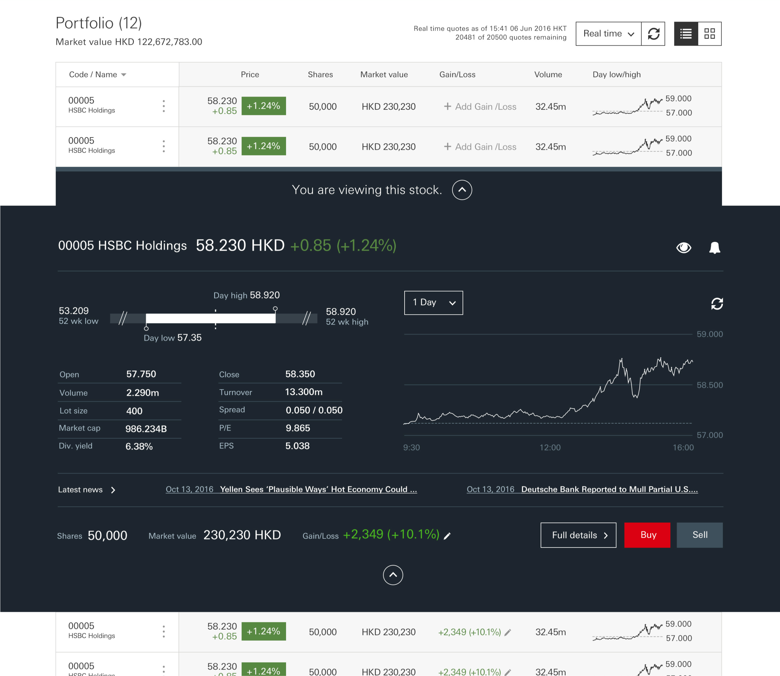
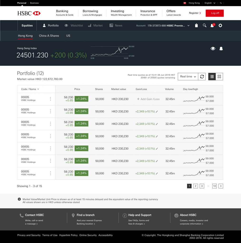
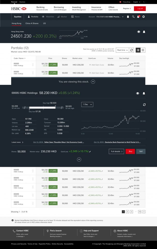
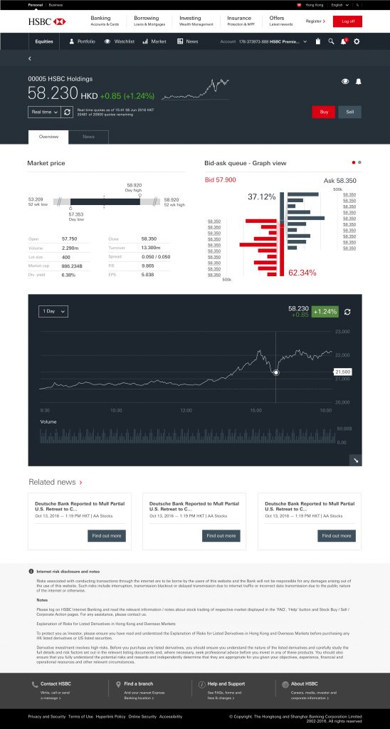
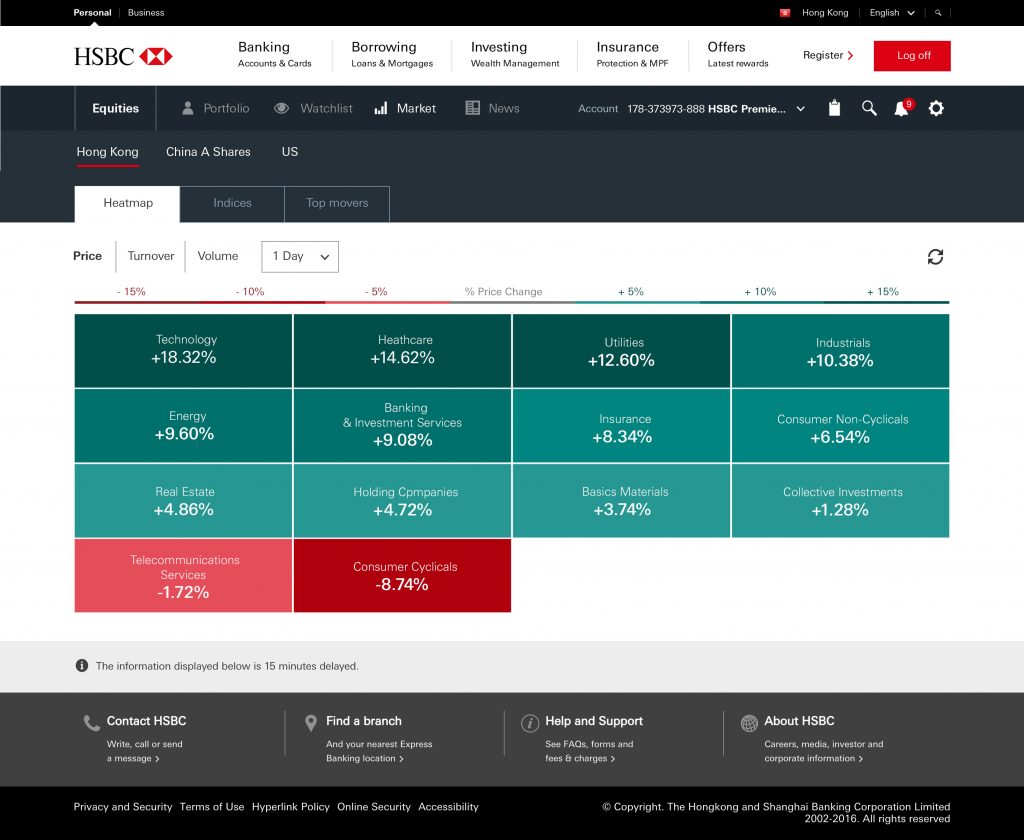
The Design
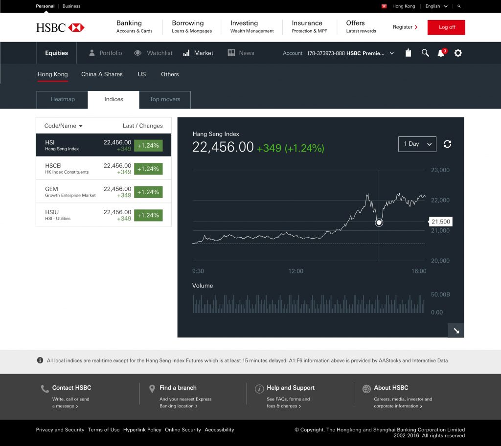
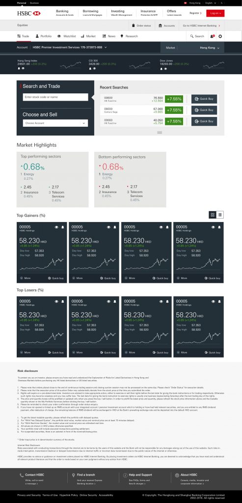
A new Stock Trading platform
The new designs were received incredibly well – although given where we were (see above!) it’s not surprising that customers loved the long overdue upgraded experience.
UI: Screen designs
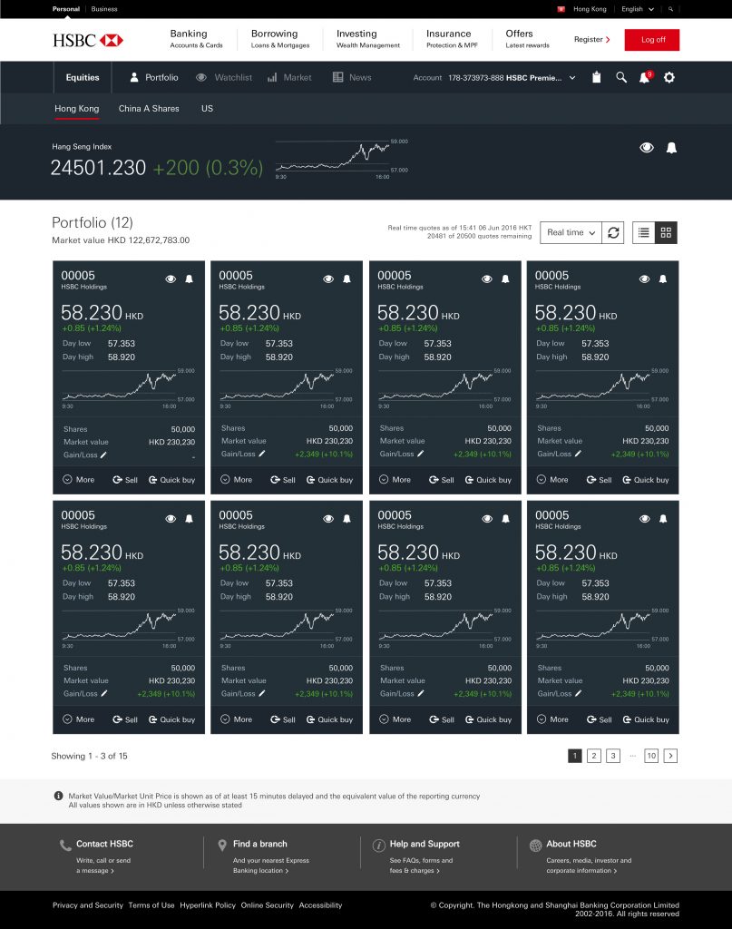
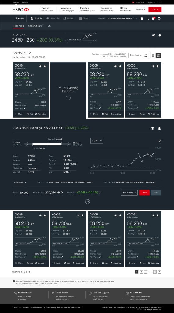
UX
Excerpts
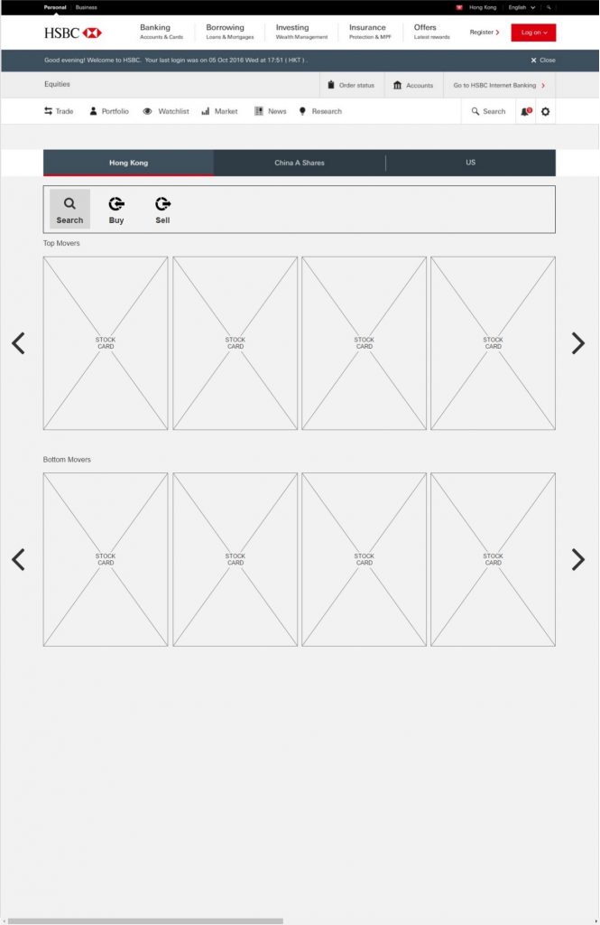
Still under construction
The Impact
Engagement increased
The launch was accompanied with gradual rollout of targeted marketing to
- existing users of the old stock trading platform
- as well as to customers we believe to be traders (or potential traders).
“The new experience is so much better – about time too!”
this update had been a very long time coming!
There was a 14% increase in engagement* within the first month and this increased further as the marketing net was cast more widely over time.
*Internal engagement scores were calculated based on logon frequency, activities, dwell time